“Garden of Healing” is a conceptual restaurant that would serve ‘Ayurvedic cuisine‘, which stems from a diet based on holistic medicinal practices that originate from India. There is a focus on consuming whole foods and balancing three energies called: Vata (Space & Air), Pitta (Fire & Water), and Kapha (Earth & Water). I was tasked to create a menu design for this conceptual restaurant using pre-existing brand elements, then pitch a brand redesign.
PROCESS: Concept
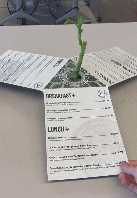
Through the first phases of sketching, a plan for an interactive rotating menu was put into motion. This would allow multiple customers to view the menu together, allowing for increased discussion and memorable moments together. Three pages act as “fins” that symbolize the three ayurvedic energies. These fins connect to a triangular core that can be placed on top of various objects like candles and potted plants to provide a point of rotation. These menus can be stacked on top of each other on a dowel for easy storage and transport.
PROCESS: Logo
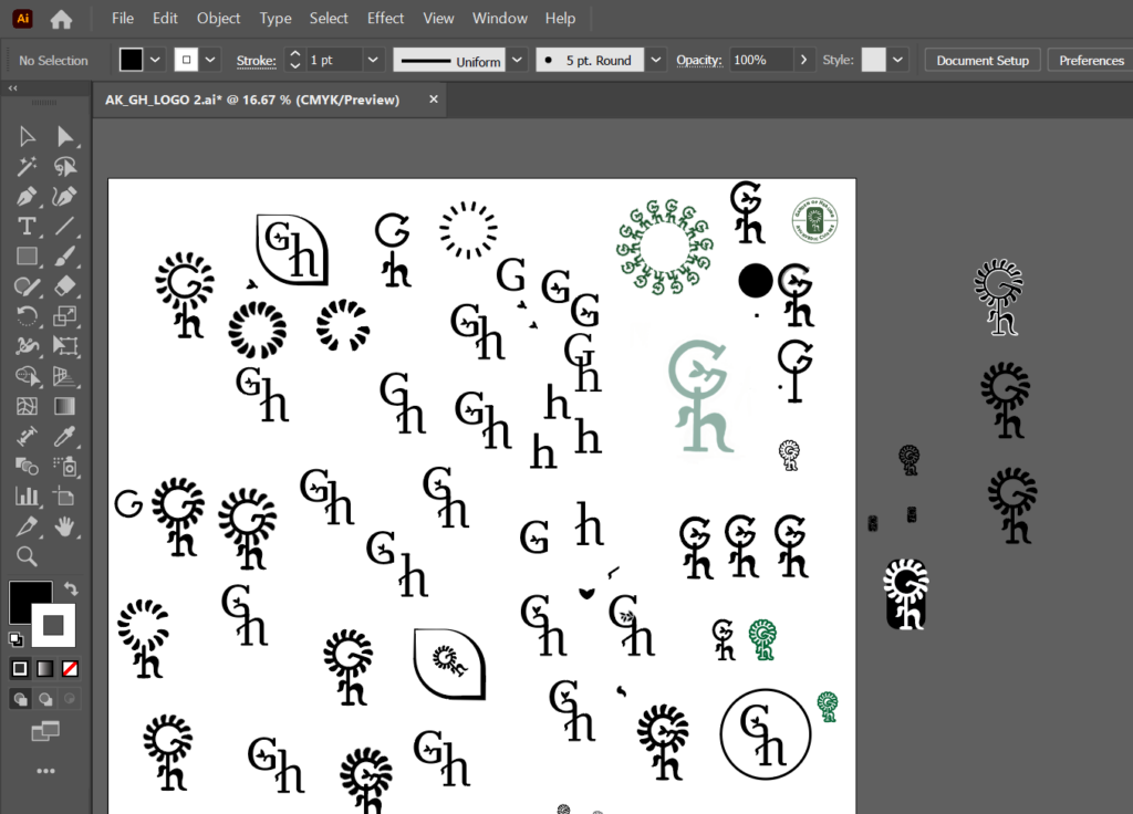
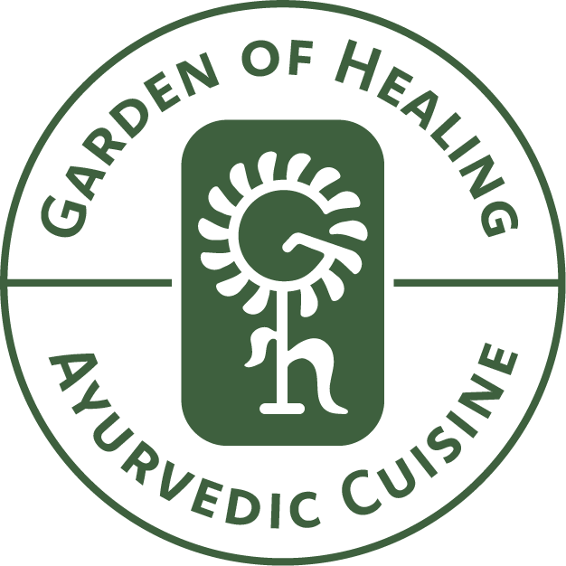
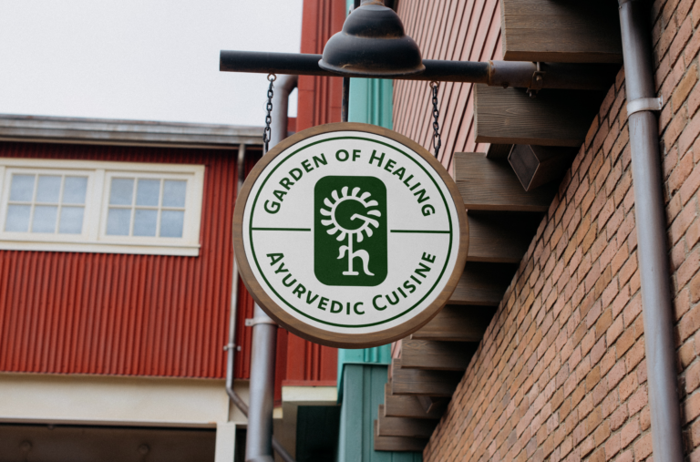
Using digital painting tools, a brand mark was conceptualized that continued the brand’s established flower symbolism, Presenting the “G” as the head of a flower, and the “H” as its leafy stem. The brand mark made its way into Adobe illustrator where it was polished further and incorporated into the brand’s new logo emblem and graphic assets.
PROCESS: Brand Identity
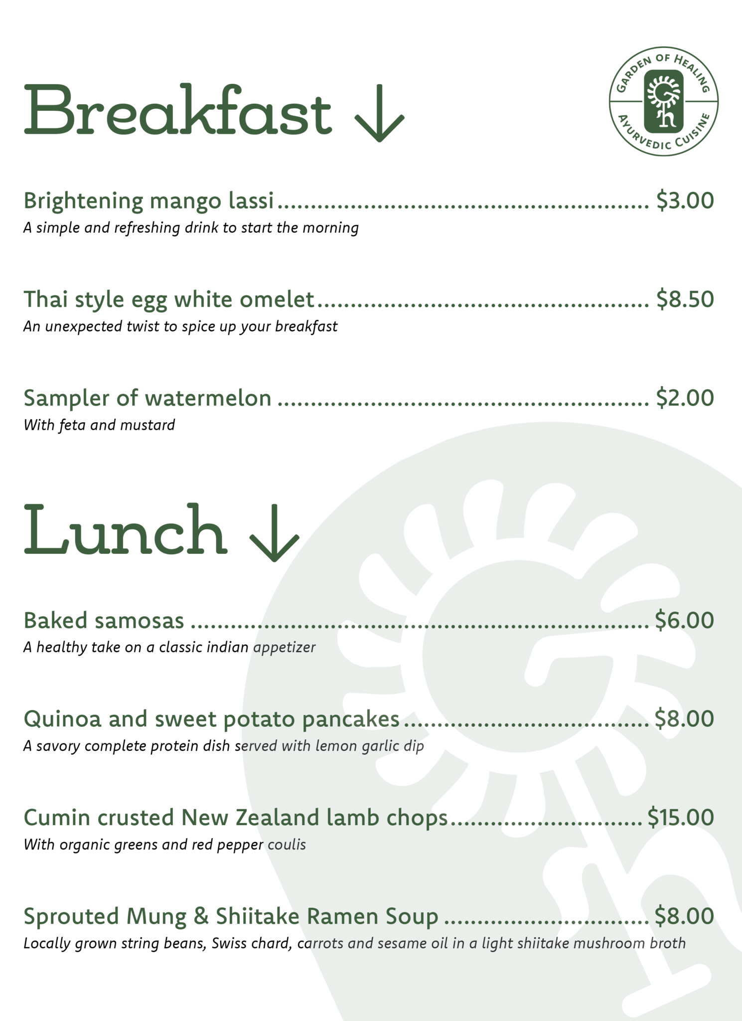
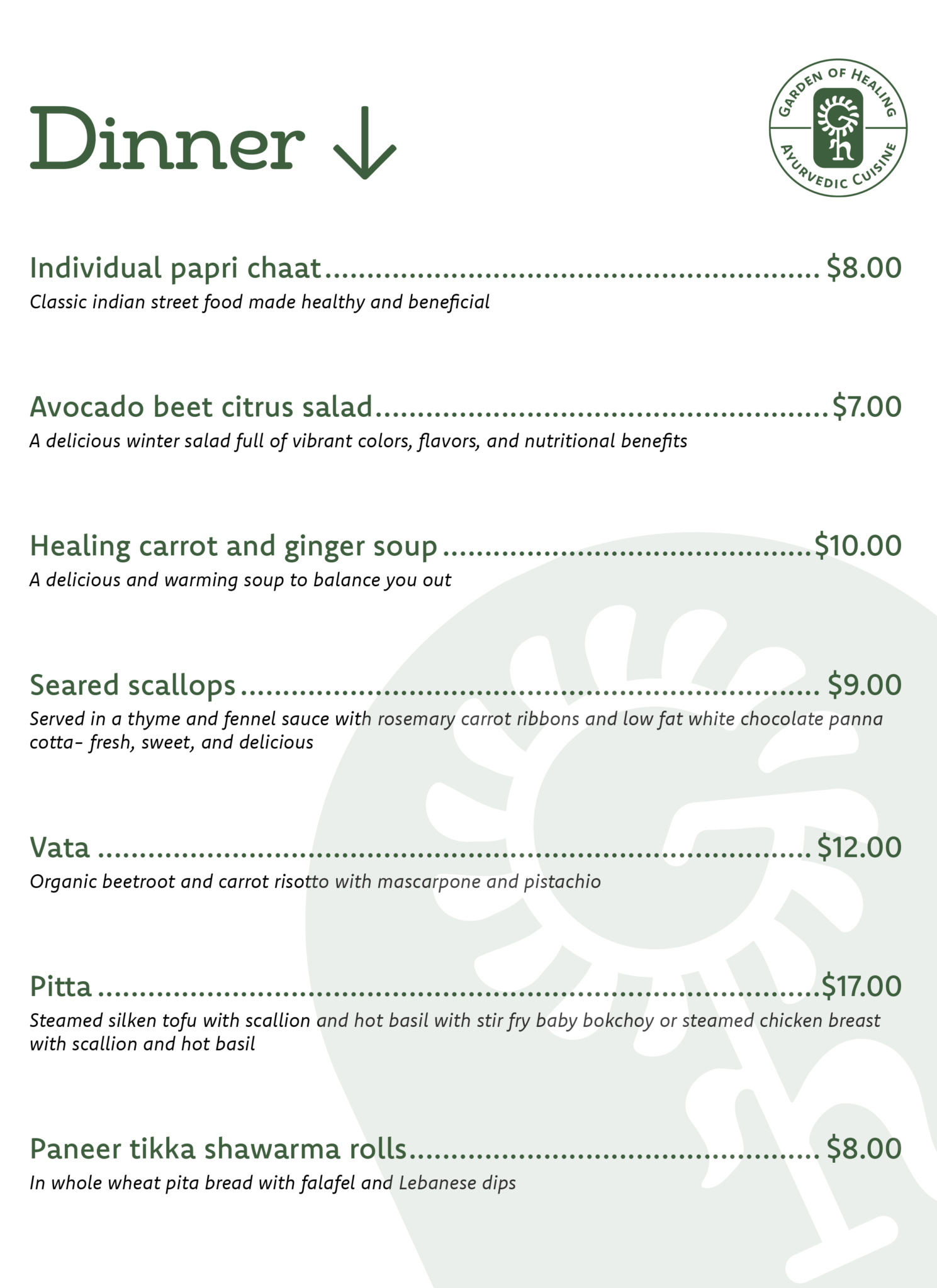
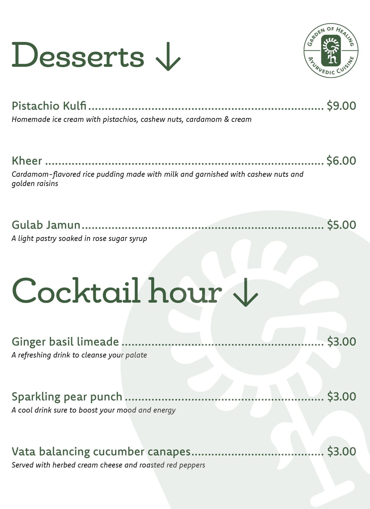
The brand’s dark green color was carried over from its existing brand identity, to convey the health and balance associated with Ayurvedic cuisine. The typeface “Komet” was selected as the central typeface of the brand, for its round and organic forms with an extremely versatile range of weights and styles. The typeface “Chennai Slab” was selected to be used for headers, for its organic forms complimented by grounding slab serifs that invoke reliability and trustworthiness, in a gentle manner. Adobe InDesign was used to format each of the rotating menu’s “Fins”
OUTCOME:
Garden of healing’s new interactive menu would put a new spin on the traditional process of ordering food, encouraging discussion and creating memorable moments. Together with the restaurant’s new brand identity, Garden of Healing would stand to represent a place of wellness, balance, and togetherness for years to come.